How to Turn Your iPhone to Grayscale (And Why You Should in 2026)
Have you ever wondered why your apps are so colorful?
Why is the notification badge a bright, alarming red? Why is the Instagram logo a sunset gradient? Why are candy-crush style games an explosion of neon?
It isn’t just for aesthetics. It is biology.
Your brain evolved to seek out bright colors. In nature, bright red meant “ripe fruit” (sugar/energy) or “danger” (blood/poison). Bright colors trigger immediate attention and excitement. Silicon Valley engineers know this. They design their interfaces to hijack this primal instinct, turning your screen into a digital candy store that is impossible to ignore.
But what happens if you turn the lights off?
What happens if you strip away the candy colors and leave only the raw information?
You get Grayscale Mode.
Turning your phone black and white is one of the most powerful (and free) hacks to reduce screen time immediately. It makes your $1,000 smartphone look like an E-ink Dumbphone, and that is exactly the point.
Here is the science behind why it works, and a step-by-step guide on how to set it up on your iPhone (and Android) in 2026.
Why Your Phone Feels Boring in Black & White
When you switch your phone to Grayscale, something strange happens.
You unlock your phone to check Instagram. You open the app. You scroll for maybe 15 seconds. And then… you stop. You close the app and put the phone away.
Why?
Because without color, Instagram is boring.
Without the stimulating red badges, the colorful stories rings, and the saturated photos, the “Dopamine Loop” is broken. Your brain stops seeing the phone as a source of entertainment and starts seeing it as a utilitarian tool.
The “Visual Saliency” Effect Neuroscience tells us that our attention is drawn to “salient” objects—things that stand out. Color is the primary driver of visual saliency. By removing color, you flatten the hierarchy of the screen. The urgent red notification looks just like the boring gray text. You regain control over where your attention goes.
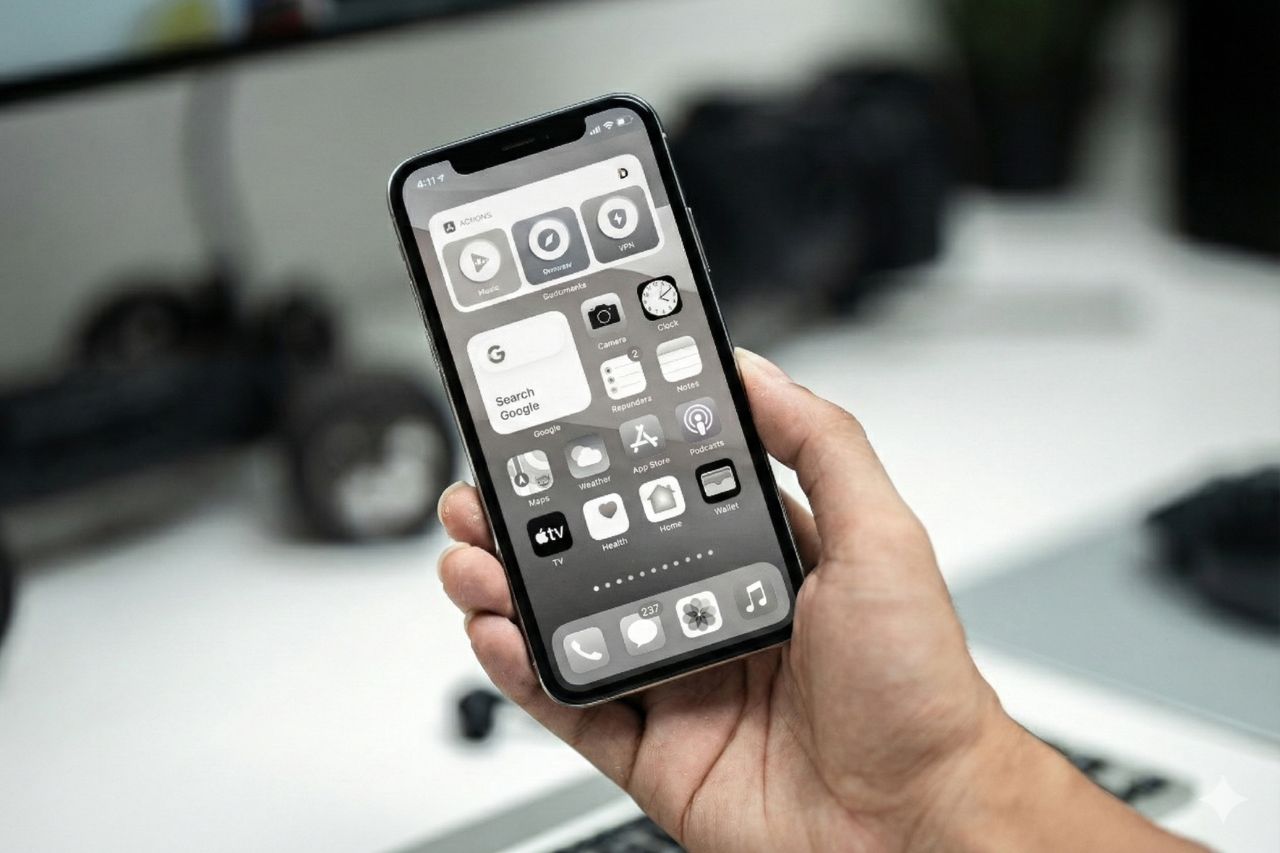
How to Turn on Grayscale on iPhone
Apple hides this feature deep in the Accessibility settings because, frankly, they want you to look at their beautiful retina displays in full color.
Here is how to find it:
- Open Settings.
- Scroll down and tap Accessibility.
- Tap Display & Text Size.
- Scroll down and tap Color Filters.
- Toggle the switch ON.
- Select Grayscale from the list.
Boom. Your vibrant world is now a noir film.
The Pro Trick: The Triple-Click Shortcut
Navigating through six menus every time you want to see a photo in color is annoying. If it’s too hard to switch back and forth, you will eventually just turn it off forever.
You need to set up the Accessibility Shortcut. This allows you to toggle Grayscale on and off just by clicking the side button three times.
Here is how to set it up:
- Go back to Settings > Accessibility.
- Scroll to the very bottom and tap Accessibility Shortcut.
- Check Color Filters.
Now, try it. Click your iPhone’s power button three times quickly. The color should pop back in. Click it three times again. Back to gray.
This gives you the best of both worlds: Grayscale by default for focus, Color on demand for maps or photos.
How to Do It on Android
If you are using an Android (and haven’t installed a Minimalist Launcher yet), you can also do this natively.
- Open Settings.
- Go to Accessibility > Visibility Enhancements (or similar).
- Tap Color Correction.
- Turn it on and select Grayscale.
Note: Many Android phones also have a “Bedtime Mode” or “Wind Down” in the Digital Wellbeing settings that automatically turns the screen gray at a specific time of night.
The 7-Day Grayscale Challenge
I challenge you to try this for just one week.
The Withdrawal Phase (Days 1-2):
You will hate it. Your phone will feel “broken.” You might even feel a phantom urge to turn the color back on just to “check” if the screen is working. That urge is your brain craving the visual stimulus it is used to.
The Clarity Phase (Days 3-7):
You will notice your Screen Time stats dropping. You will realize that you are no longer doom-scrolling while walking or eating. You will use your phone for specific tasks (Maps, Spotify, Calling) and then immediately put it back in your pocket.
You haven’t changed your willpower; you have changed your environment.
When Should You Use Color?
Living in 100% grayscale isn’t practical for everything. Here is my rule of thumb for toggling the color back on (using the triple-click trick):
- Maps/Navigation: Differentiating between a blue river and a gray road is important.
- Photos: If you are taking a picture or showing one to a friend.
- Video Calls: Seeing your loved ones in gray feels a bit depressing.
For everything else—Twitter, Email, Web Browsing, Texting—keep it gray. Text is just as readable in black and white. You aren’t missing any information; you are just missing the stimulation.
The “Poor Man’s” Dumbphone
If you aren’t ready to spend $300 on a Light Phone or buy expensive Blue Light Glasses, this is the best first step you can take.
It costs $0. It takes 30 seconds to set up. And it fundamentally changes your relationship with your device.
Your phone is a tool. It shouldn’t look like a toy. Make it boring, and you might just find your life becoming a lot more interesting.